Blog

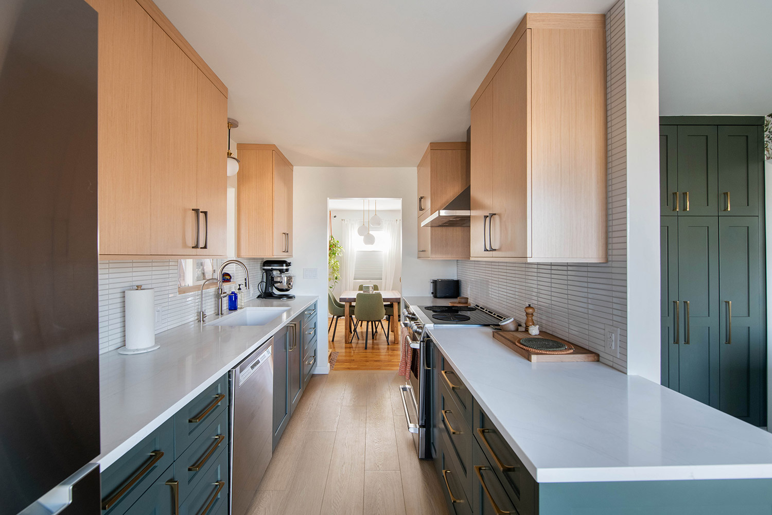
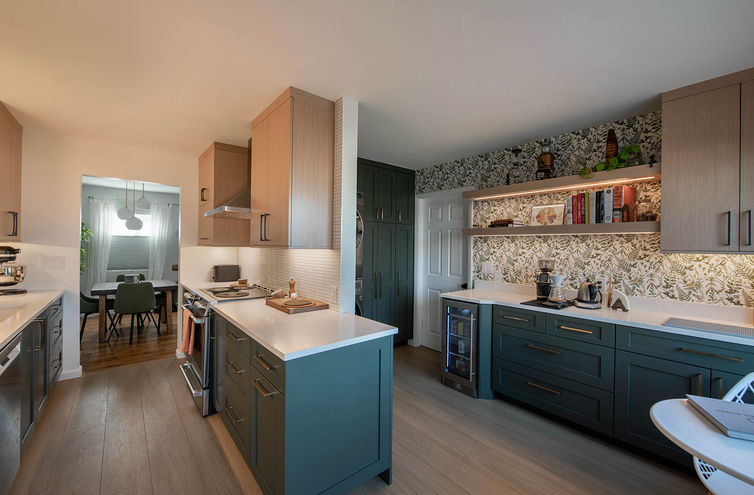
Sometimes an element of a project that initially feels like one of its biggest challenges turns out to be its most valuable asset. In the case of the Perkins project, designer Beth Parker took what initially felt like a small kitchen space and transformed it into a multi-functional area filled with light and modern charm. Nothing about this kitchen now feels cramped or crowded—from the broad expanse of gleaming white Quartzite counter tops to the sweep of ceiling-height cabinets.
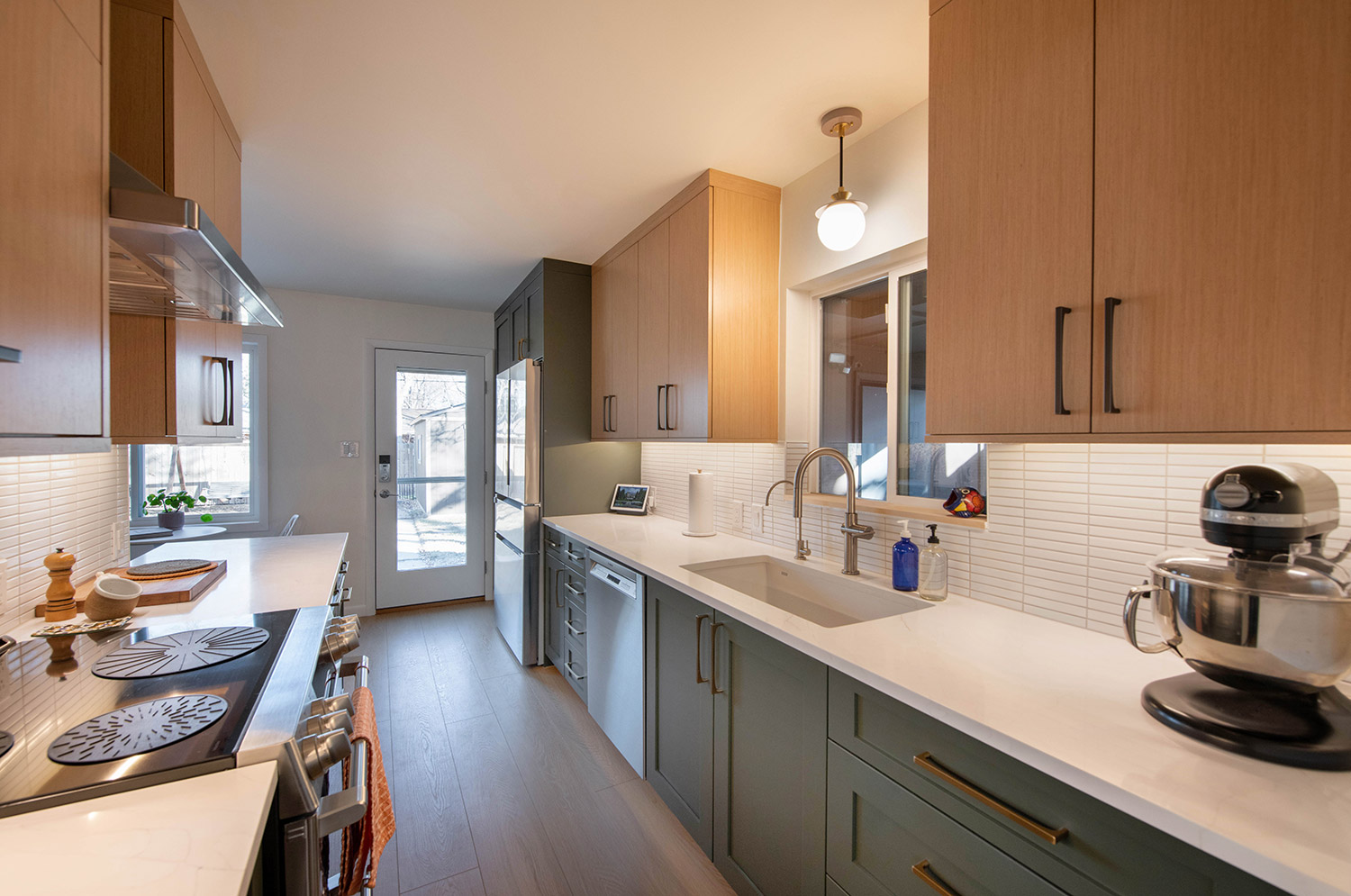
The light natural finish of reconstituted white oak uppers shows to best advantage in their flat-panel design, reflecting the neutral tones found in the timeless wide-plank hardwood flooring. Choosing a darker tone for lower (and even some upper) cabinets makes a savvy design statement, especially in this rich, deep blue-green shade.
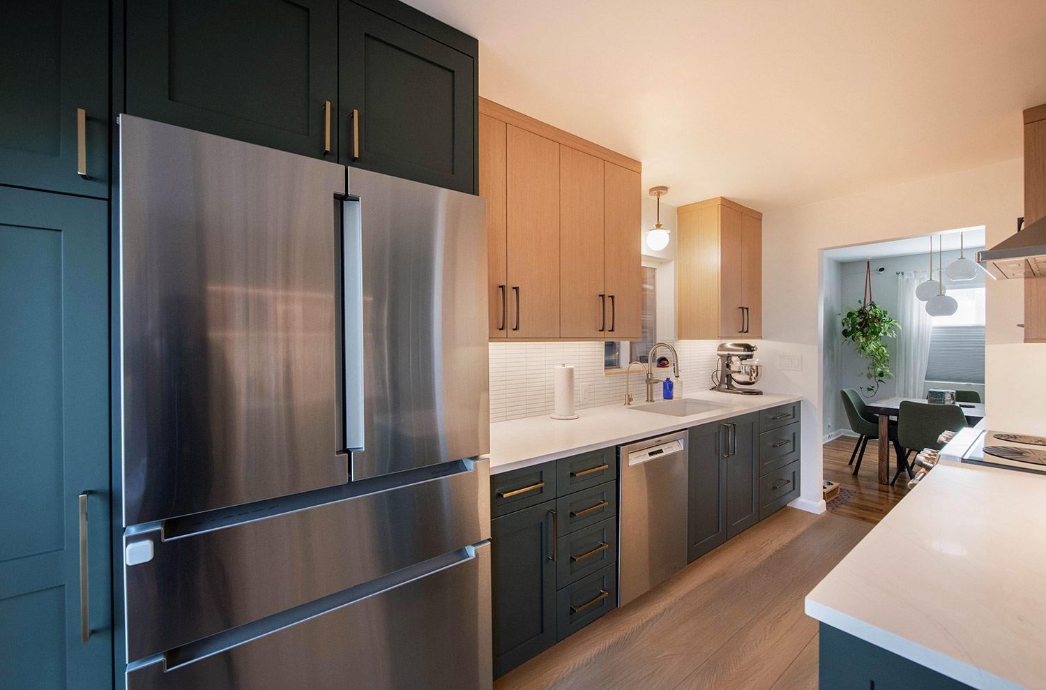
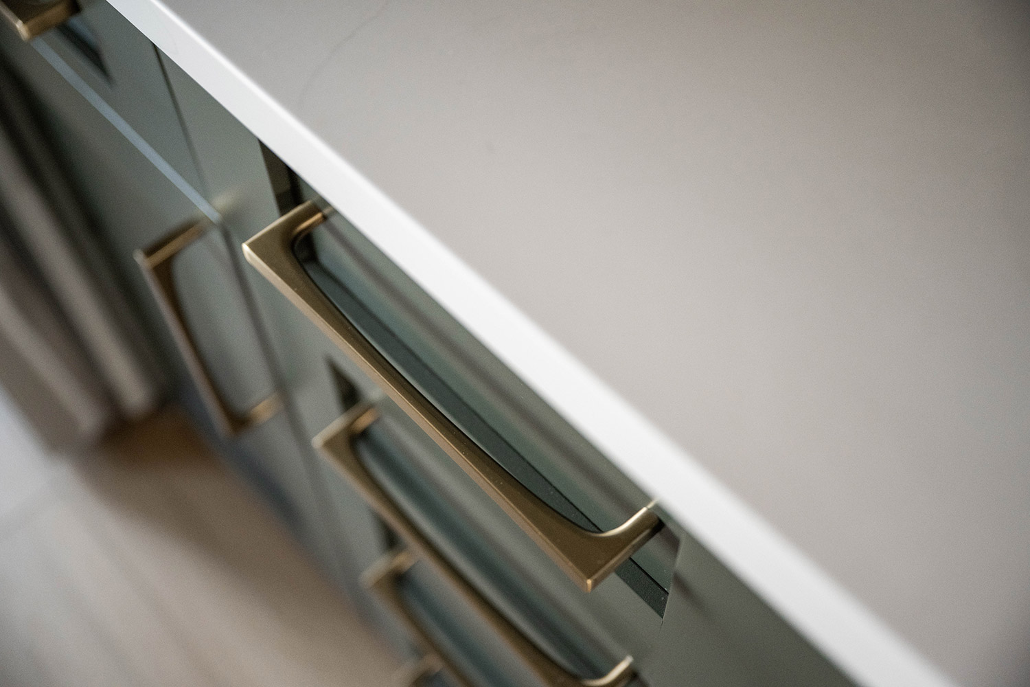
Notice how gleaming brass pulls provide a striking note of refinement against the darker cabinets, while the same style hardware—in matte black—is used on the lighter cabinets, creating a pleasing balance.
In a kitchen where every square foot must be utilized to full advantage, the smart choice was made to design the main kitchen workspace in a galley style, with one counter top extended to create a small peninsula that divides the main area from the secondary space.
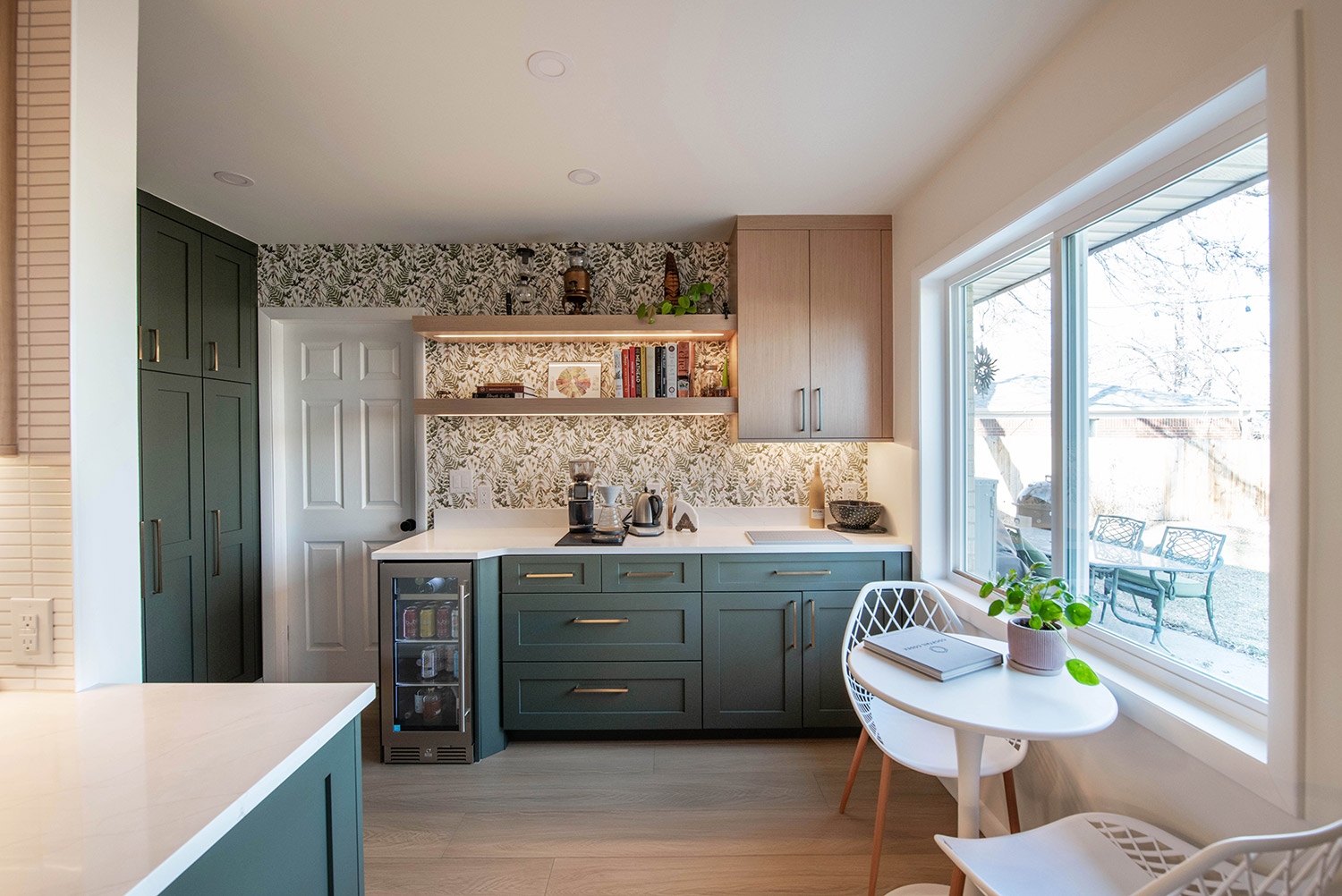
Secondary space—yes. Second-rate? Not a chance! With two walls of cabinets, open shelving, and room for a washer, dryer, beverage center, and eating area, this side of the kitchen packs a punch.
An accent wall of botanical print wallpaper creates a fresh yet sophisticated vibe.
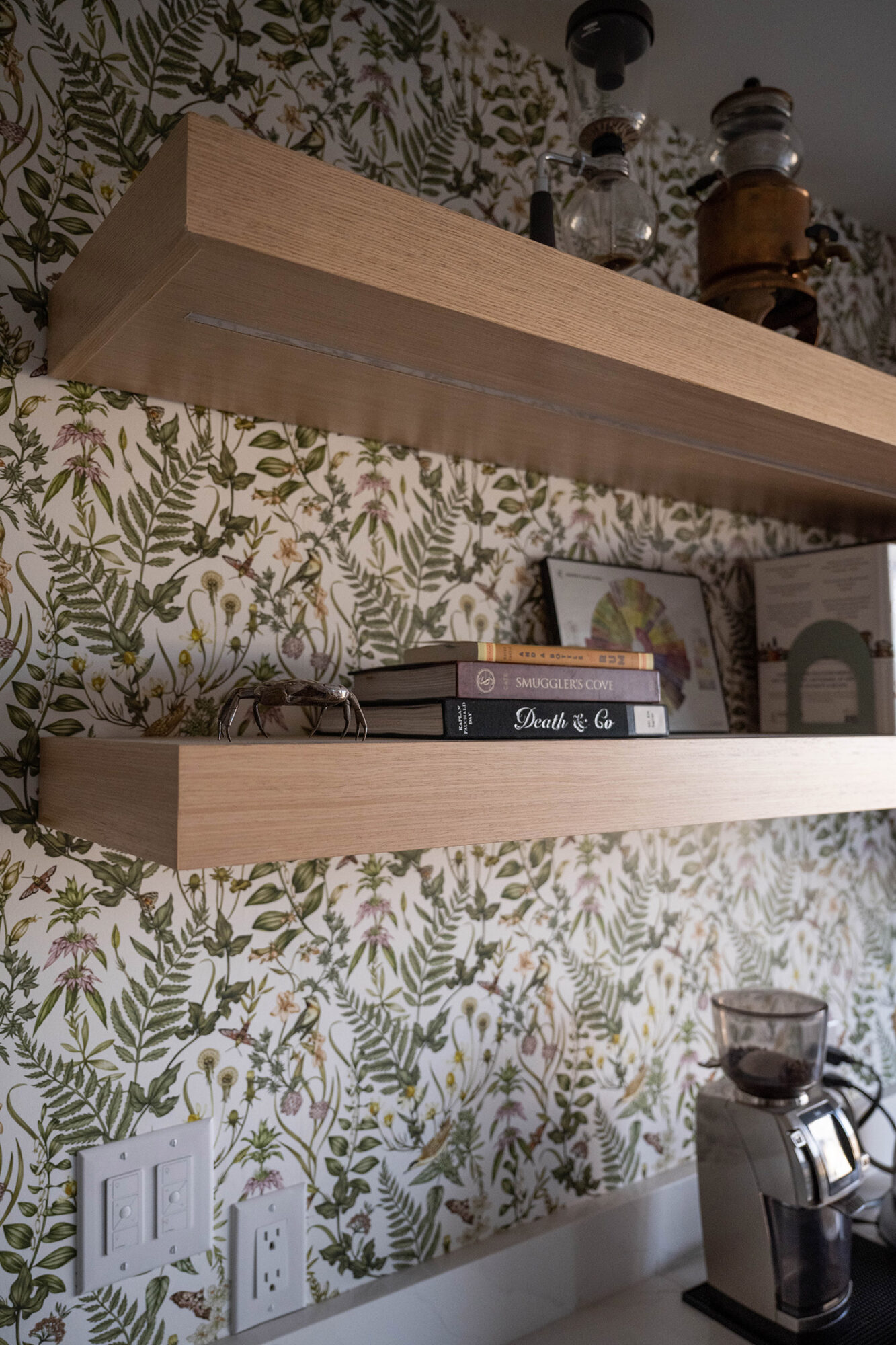
The large window floods the area with natural light, and under-shelf lighting casts a cheerful glow even on the cloudiest of days.
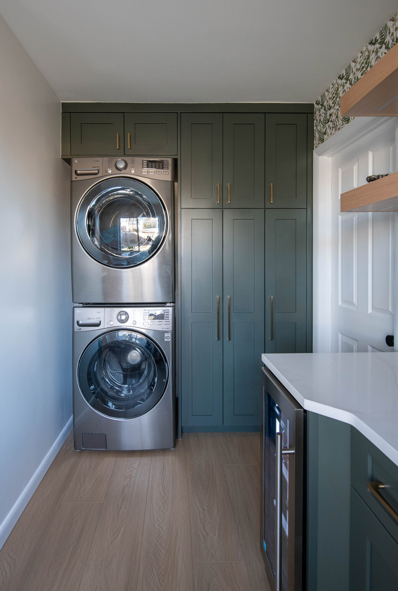
The back wall makes use of every square inch of space with floor-to-ceiling cabinets and a stackable washer and dryer.
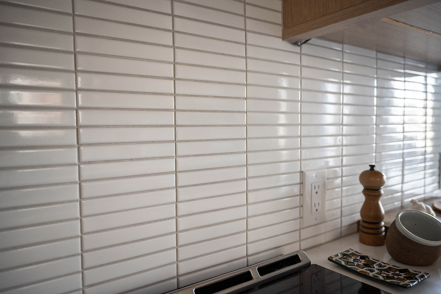
No detail is overlooked, whether in form or function. Pleasing rows of linear stick tile form the counter-to-ceiling splash, bouncing light throughout the space,
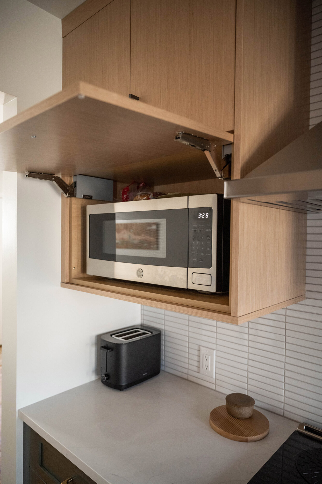
and a conveniently-placed appliance garage hides the microwave from view while keeping it easily within reach.
The Perkins project turned out to be the perfect mix of functionality and style, proving that you needn’t sacrifice one for the other.
At Caruso Kitchens we work with you to discuss design preferences, budget priorities, and scheduling concerns. With a showroom of over 5,000 sq. ft. filled with inspiration, you can see, touch, and experience first-hand the cabinets, counter tops, and appliances that will go into your home. Our team of designers would love to work with you through every step of your home renovation! Contact us today to schedule a free design consultation.

